Introduction: Your Visual Key to Understanding the Crypto Market
The world of cryptocurrency trading can feel like navigating a sea of numbers and fluctuating prices. To make sense of this dynamic landscape and make informed decisions, one of the most essential skills you can acquire is the ability to read crypto charts. These visual representations of price movements over time provide invaluable insights into market trends, potential support and resistance levels, and overall sentiment.
Don’t let the seemingly complex lines and indicators intimidate you. Reading crypto charts is a skill that can be learned, and this beginner-friendly guide is here to demystify the process. Think of charts as the visual language of the market, telling a story about the historical price action of a cryptocurrency. By learning to interpret these stories, you can gain a significant edge in your trading journey.
This article will walk you through the fundamental elements of crypto charts, explaining the different types, key components, and basic patterns that can help you understand market movements and make more strategic trading decisions. We’ll break down the jargon and use clear, humanized explanations to empower you to confidently navigate the world of crypto charting.

The Anatomy of a Crypto Chart: Understanding the Basics
Most cryptocurrency charting platforms, whether on exchanges or dedicated charting websites, display similar core elements. Understanding these components is the first step to deciphering the visual language of the market:
1. Price Action: The Story of Supply and Demand
The primary purpose of a crypto chart is to visualize the price action of a cryptocurrency over a specific period. This price movement is a direct result of the forces of supply and demand in the market. When there are more buyers than sellers, the price tends to go up. When there are more sellers than buyers, the price tends to go down. Charts visually represent this constant tug-of-war.

2. Timeframes: Zooming In and Out on Market Movements
Timeframes allow you to view the price action at different levels of detail. You can analyze price movements over short periods (like 1 minute, 5 minutes, 15 minutes) for day trading or scalping, or over longer periods (like 1 hour, 4 hours, daily, weekly, monthly) for swing trading or long-term investing. The timeframe you choose will depend on your trading style and investment horizon.
- Shorter Timeframes: Provide more granular detail and are useful for identifying short-term trends and making quick trading decisions. However, they can also be more volatile and prone to “noise” (random price fluctuations).
- Longer Timeframes: Offer a broader perspective on the overall trend and are less susceptible to short-term volatility. They are useful for identifying major support and resistance levels and long-term market sentiment.

3. Price Representation: Different Ways to Visualize Price
There are several ways to represent the price action on a chart. The most common types include:
- Line Charts: The simplest type, connecting the closing prices of each period with a continuous line. While easy to read, they don’t show the open, high, and low prices within a period.
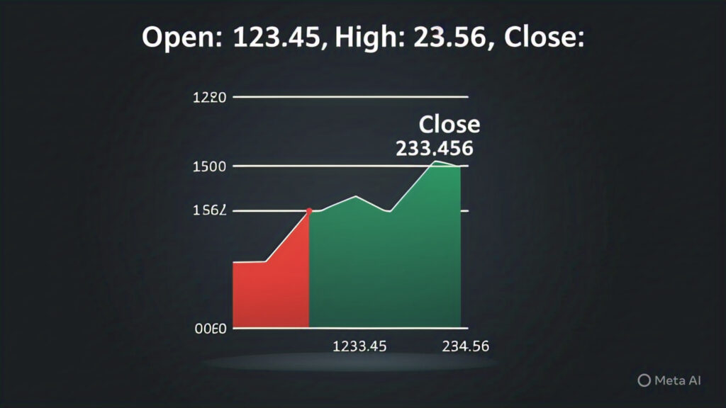
Bar Charts (OHLC Charts): Each bar represents a specific time period and shows the Open price (the price at the beginning of the period), the High price (the highest price reached during the period), the Low price (the lowest price reached during the period), and the Close price (the price at the end of the period). The vertical line represents the high-low range, and the small horizontal dashes indicate the open (left) and close (right) prices.
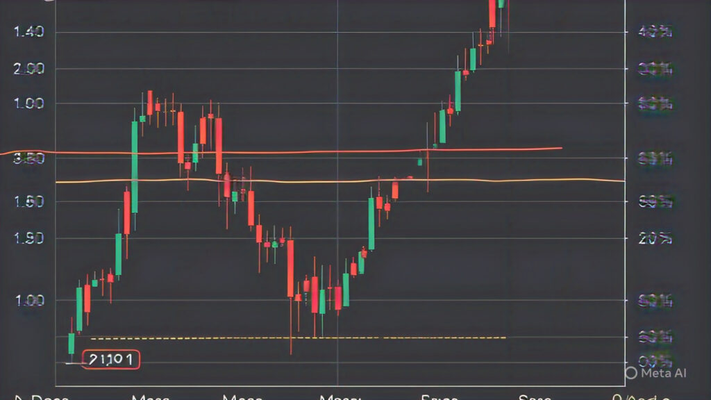
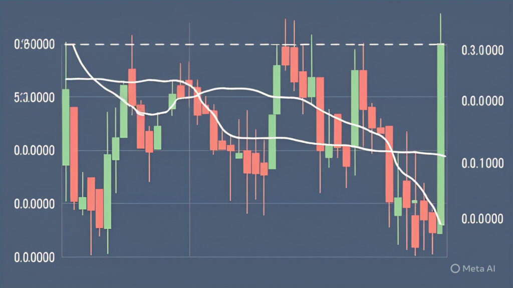
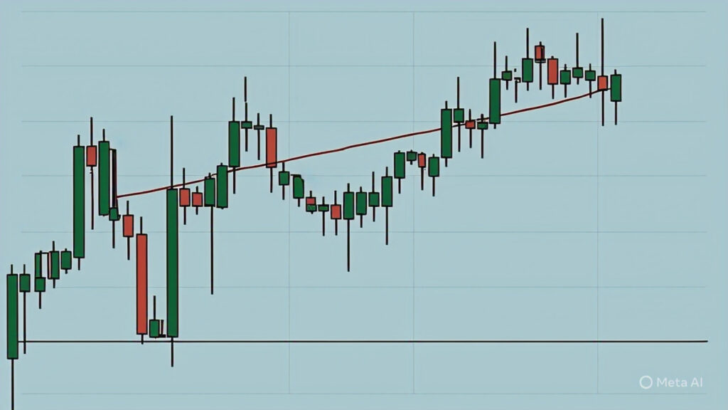
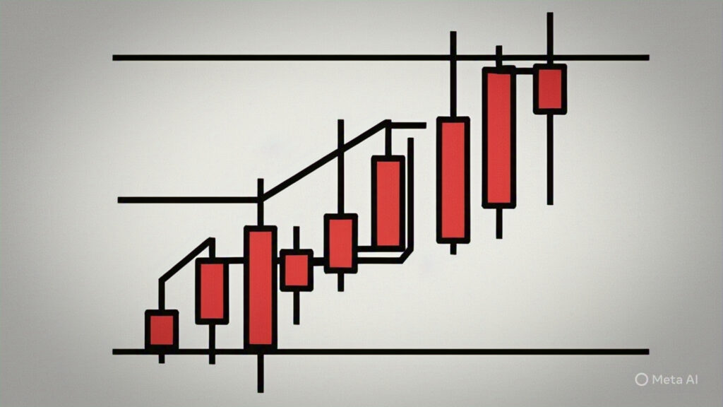
Candlestick Charts: The most popular type among traders. Each candlestick also represents a specific time period and shows the Open, High, Low, and Close prices. The “body” of the candlestick is filled in if the closing price is lower than the opening price (bearish, often colored red), and hollow or filled with a different color (bullish, often colored green) if the closing price is higher than the opening price. The thin lines extending above and below the body are called “wicks” or “shadows” and represent the high and low prices for that period.

Area Charts: Similar to line charts but with the area below the line filled in, often used to emphasize the magnitude of price movements.
For beginners, candlestick charts are highly recommended as they provide the most comprehensive information about price action within a given timeframe.
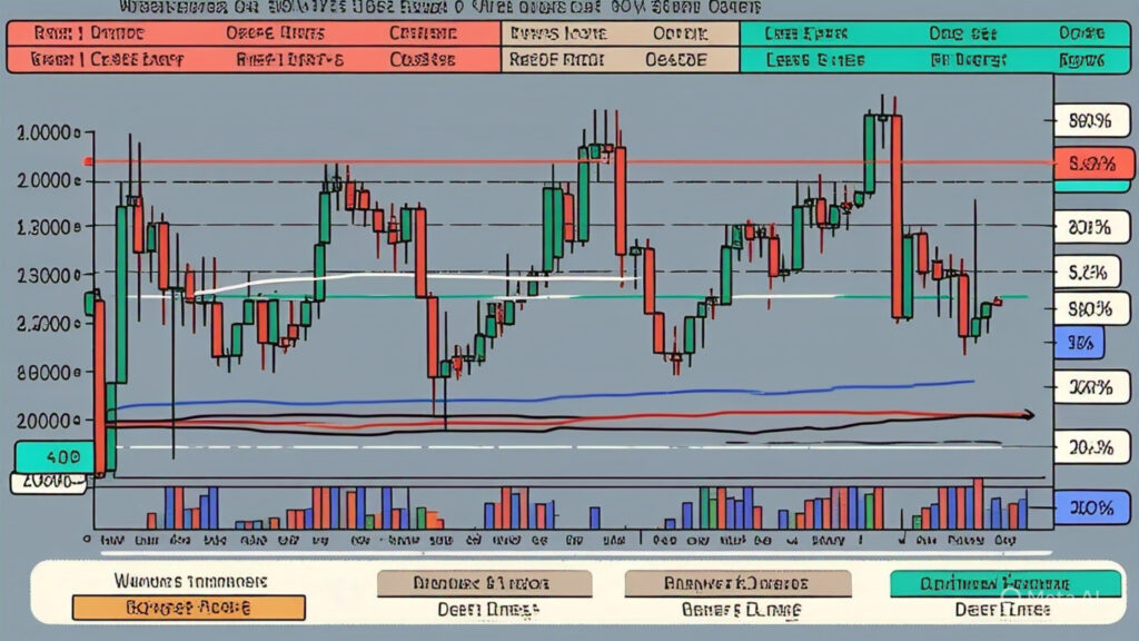
4. Volume: Measuring the Strength Behind the Movement
Volume bars, typically displayed at the bottom of the chart, represent the amount of a cryptocurrency that was traded during each specific time period. Volume provides crucial insights into the strength and significance of price movements.
- High Volume: Indicates strong interest and conviction behind a price move. A price increase on high volume suggests strong buying pressure, making the move more likely to be sustained. Conversely, a price decrease on high volume suggests strong selling pressure.
- Low Volume: Suggests a lack of strong conviction behind a price move. Price movements on low volume may be less reliable and more prone to reversals.

Decoding Candlestick Patterns: Recognizing Market Signals
Candlestick charts are particularly valuable because they form patterns that can provide clues about potential future price movements. Recognizing these basic candlestick patterns can give you an edge in your trading:
1. Bullish Engulfing: A Sign of Potential Uptrend
A bullish engulfing pattern occurs when a small bearish (red) candlestick is followed by a large bullish (green) candlestick that completely “engulfs” the previous red candlestick. This pattern often signals a potential reversal from a downtrend to an uptrend, indicating strong buying pressure.

2. Bearish Engulfing: A Sign of Potential Downtrend
A bearish engulfing pattern is the opposite of the bullish engulfing. It occurs when a small bullish (green) candlestick is followed by a large bearish (red) candlestick that completely engulfs the previous green candlestick. This pattern often signals a potential reversal from an uptrend to a downtrend, indicating strong selling pressure.

3. Hammer and Hanging Man: Potential Trend Reversals
- Hammer: A bullish reversal pattern that typically occurs at the bottom of a downtrend. It has a small body near the high and a long lower wick (at least twice the length of the body), indicating that although there was selling pressure during the period, buyers ultimately pushed the price back up.
- Hanging Man: A bearish reversal pattern that typically occurs at the top of an uptrend. It looks the same as a hammer but appears after a price increase, suggesting that selling pressure is starting to emerge.
4. Doji: Indecision in the Market
A Doji candlestick has a very small body, indicating that the opening and closing prices were virtually the same. The wicks can vary in length. Doji patterns often signal indecision in the market and can precede a trend reversal. Different types of Doji (e.g., Dragonfly Doji, Gravestone Doji) can offer further clues.

5. Three White Soldiers and Three Black Crows: Strong Trend Signals
- Three White Soldiers: A bullish pattern consisting of three consecutive long bullish (green) candlesticks that close progressively higher than the previous candle, signaling a strong potential uptrend.
- Three Black Crows: A bearish pattern consisting of three consecutive long bearish (red) candlesticks that close progressively lower than the previous candle, signaling a strong potential downtrend.
These are just a few basic candlestick patterns. There are many more complex patterns that traders use to analyze market sentiment and predict potential price movements.
Incorporating Volume Analysis: Confirming Price Action
While price action tells one part of the story, volume analysis provides crucial context and can help confirm the strength and reliability of price movements and candlestick patterns.
- Price Increase with High Volume: Suggests strong buying interest and increases the likelihood that the uptrend will continue.
- Price Increase with Low Volume: May indicate a lack of strong conviction and could be a “fakeout” or a less sustainable move.
- Price Decrease with High Volume: Suggests strong selling pressure and increases the likelihood that the downtrend will continue.
- Price Decrease with Low Volume: May indicate a lack of strong selling pressure and could be a temporary pullback.
- Volume Spikes: Significant increases in volume can often accompany breakouts from consolidation patterns or reversals in trends.
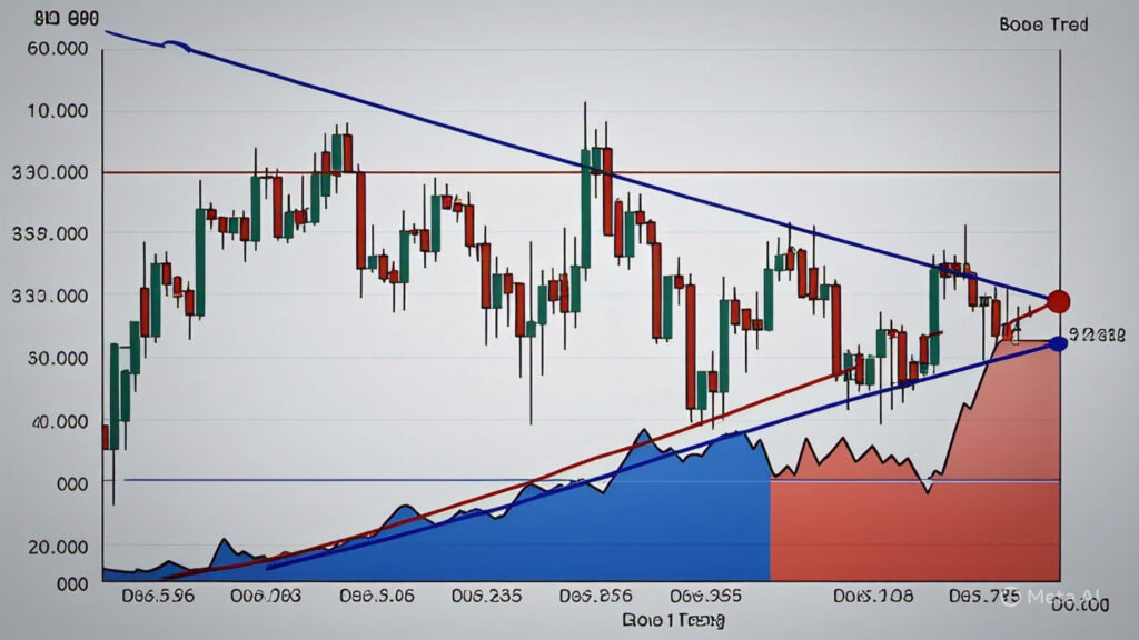
Understanding Trendlines: Identifying the Direction of the Market
Trendlines are lines drawn on a chart to connect a series of highs (downtrend line) or lows (uptrend line). They help visualize the direction of the prevailing trend and can also act as potential support and resistance levels.
- Uptrend Line: Drawn by connecting a series of higher lows. The price tends to bounce off this line.
- Downtrend Line: Drawn by connecting a series of lower highs. The price tends to be rejected by this line.
Support and Resistance Levels: Identifying Potential Turning Points
Support levels are price levels where buying pressure is expected to be strong enough to prevent the price from falling further. Resistance levels are price levels where selling pressure is expected to be strong enough to prevent the price from rising further. Identifying these levels can help you anticipate potential price reversals or breakouts.
- Support and resistance levels can be horizontal lines drawn at significant previous highs or lows, or they can be dynamic, such as trendlines or moving averages.

Basic Chart Patterns: Recognizing Recurring Formations
Over time, certain price patterns tend to repeat themselves on charts and can offer clues about potential future price movements. Some basic patterns include:
- Triangles (Ascending, Descending, Symmetrical): Indicate periods of consolidation that often precede a breakout in either direction.
- Rectangles: Another consolidation pattern where the price trades within a defined range.
- Head and Shoulders (Bullish Inverse and Bearish): Reversal patterns that suggest a change in the prevailing trend.
- Double Top and Double Bottom: Also reversal patterns indicating that a price level has been tested twice and failed to break.

Conclusion: Your Journey to Chart Mastery Begins
Learning to read crypto charts is a fundamental skill for anyone looking to navigate the cryptocurrency market effectively. While it may seem daunting at first, understanding the basic elements like price representation, timeframes, volume, candlestick patterns, trendlines, and support/resistance levels will provide you with a powerful visual tool for analyzing market sentiment and potential price movements.
Remember that chart reading is not an exact science, and no pattern or indicator is foolproof. It’s essential to combine chart analysis with other forms of research, such as fundamental analysis and understanding market news. However, by diligently studying charts and practicing your interpretation skills, you’ll gain a significant advantage in understanding the story the market is telling and making more informed trading decisions on your journey through the exciting world of cryptocurrency. Keep practicing, stay curious, and let the charts be your guide!